Inventory Valuation Product Drilldown
The Inventory Valuation Product Drilldown page is the detailed intelligence screen for one product inside the inventory valuation report. It explains what stock currently exists, what that stock cost, how much of it sold, where losses occurred, whether the product is healthy or risky, and what action the business should consider next.
Overview
This page is designed to answer practical business questions. A product may have stock, but is that stock moving? A product may show revenue, but is it profitable after losses? A product may be selling, but does current stock cover the next 30 days? A product may have rising purchase cost, but has the selling price adjusted with it? The drilldown page exists to answer those questions clearly.
- Show the live financial and inventory position of one product.
- Explain how purchase history affects stock value and average cost.
- Explain how sales affect revenue, cost recovery, and gross profit.
- Identify loss-causing events such as damage, expiry, or missing stock.
- Forecast short-term demand and reorder pressure.
- Provide a manager-friendly recommendation block with suggested actions.
- Give traceability through batches, movements, and timeline tables.
Recommended Page Flow
The page should be structured in a clear business order so the user first understands the overall condition and then moves down into evidence and details.
- Hero section
- Smart recommendation block
- Quick insight cards
- Premium analytics cards
- Mini chart area
- Sticky navigation
- Detailed evidence tables
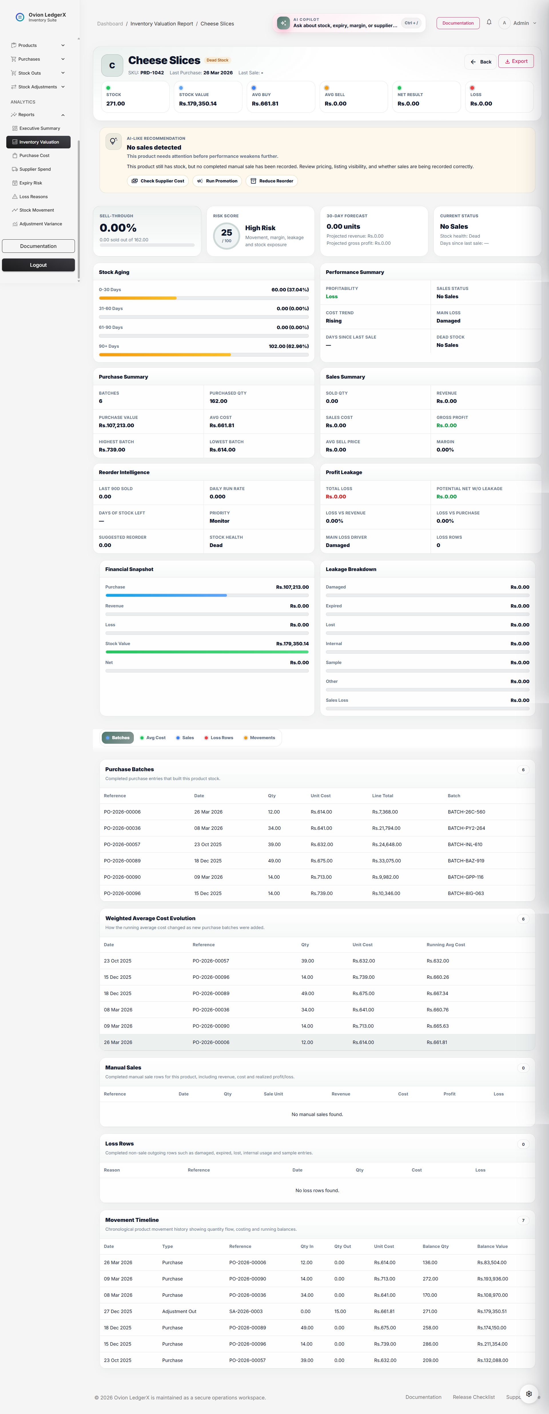
1. Hero Section
The hero section is the visual introduction of the selected product. It shows the product identity together with the highest-priority inventory and financial KPIs. This allows the user to understand the product's condition immediately without reading the rest of the page first.
Product Name
This is the display name of the selected product. It confirms which product the report belongs to and anchors every number shown below it.
Product Avatar / Initial
A small visual identity block showing the first letter of the product name. It improves recognition and makes the page feel more premium and easier to scan.
Health Badge
The health badge is a compact status label that summarizes the overall state of the product. It is not entered manually. It is calculated by the report using a simple decision flow based on net result, total loss, and sales movement.
The badge exists so the user does not need to read all cards first before understanding whether the product is in a safe, risky, or stagnant condition.
If Net Result > 0 and Total Loss is 0 or very low -> Healthy
 Else if Net Result < 0 -> Loss Risk
 Else if Current Stock > 0 and Sold Quantity <= 0 -> Dead Stock
 Else -> Mixed
Healthy means the product is making money and losses are not significantly damaging the outcome. Loss Risk means the product is ending in a negative result after cost and leakage are considered. Dead Stock means stock exists, but the product is not meaningfully moving through sales. Mixed means the product shows a combination of positive and negative signals, so it cannot be categorized as clearly healthy or clearly bad.
SKU
The SKU or internal code helps the user identify the product operationally, especially when product names are long or similar.
Last Purchase Date
This is the most recent completed purchase date recorded for the product. It tells the user when the stock was last replenished.
Working logic: the report finds the latest completed purchase row for this product, orders purchase records by purchase date descending, and displays the first result.
Last Sale Date
This is the most recent completed manual sale date recorded for the product. It helps determine whether the product is actively moving or becoming stagnant.
Working logic: the report filters completed stock-out rows whose reason is manual sale, sorts them by sale date descending, and displays the latest one.
Stock
This value represents the current available quantity of the product.
Current Stock = current stock balance available for the productWorking logic: this usually comes from the product's running stock balance or stock ledger balance. It reflects what is still available after purchases add stock and sales or other stock-out reasons reduce stock.
Stock Value
This value estimates how much money is currently tied up in the remaining stock of the product.
Stock Value = Current Stock × Average Purchase CostWorking logic: once the report knows how many units remain and what the average acquisition cost is, it multiplies both values. This gives the user an estimate of capital currently locked in inventory.
Average Buy
This is the weighted average acquisition cost of the product.
Average Purchase Cost = Total Purchase Value / Total Purchased QuantityWorking logic: the report sums the value of all completed purchase rows for the product and divides that by the total quantity purchased. This produces a weighted average rather than a simple average of prices, which is more accurate when quantities vary from batch to batch.
Average Sell
This is the realized average selling price of the product.
Average Sell Price = Sales Revenue / Sold QuantityWorking logic: the report adds revenue from completed manual sales only and divides that total by the sold quantity. This reflects real selling behavior instead of a list price or configured sale price.
Net Result
This is one of the most important values on the page because it reflects the final outcome after losses are considered.
Net Result = Gross Profit - Total LossWorking logic: the page first calculates the gross profit generated from completed sales. It then subtracts all recognized loss categories such as damage, expiry, missing stock, samples, internal usage, and sales-side losses. A positive result means the product still contributes value overall. A negative result means leakage or pricing issues are wiping out commercial benefit.
Total Loss
This shows the combined money lost through all recognized loss categories.
Total Loss = Damaged + Expired + Lost + Internal Usage + Sample + Other + Sales LossWorking logic: the report groups non-sale stock-outs by reason and sums their loss amounts. It may also include loss realized on sales if a sale occurred below cost. This total is shown separately because a product can generate gross profit and still end in a poor final result if leakage is high.
2. Smart Recommendation Block
The smart recommendation block is designed to feel like an intelligent assistant. It summarizes the product's overall state in human language and offers guided actions.
How the Recommendation Is Derived
The recommendation is rule-driven. The page checks important signals such as whether sales exist, whether stock is turning into revenue, whether net result is negative, whether losses are high, and whether purchase cost is rising. Based on those checks, it creates one or more recommendation items and chooses a primary one to display at the top.
If Current Stock > 0 and no manual sale exists -> "No sales detected"
 If Dead Stock Band is Dead 30d / 60d / 90d -> "Dead stock risk"
 If Net Result < 0 -> "Negative net result"
 If Gross Profit > 0 and Total Loss > 0 -> "Profit exists, but leakage is visible"
 If Cost Trend is Rising -> "Purchase cost is rising"
 If Sold Qty > 0 and Margin % is strong and Net Result > 0 -> "Strong performer"
 If Current Stock <= 0 and Net Result > 0 -> "Possible replenishment candidate"
Recommendation Title
This is the main issue or opportunity label shown at the top of the recommendation block, for example No sales detected, Negative net result, Purchase cost is rising, or Strong performer.
Working logic: the title comes from the highest-priority triggered rule. The most severe or most useful insight is usually shown first.
Recommendation Summary
A short human summary that explains the overall condition of the product without making the user read all other cards first.
Working logic: the summary usually depends on the recommendation tone. For example, a success tone may say the product is performing well overall, while a danger tone may say the product is underperforming and needs corrective action.
Recommendation Message
This is the detailed explanation of why the recommendation appears. It translates rules and metrics into manager-friendly language.
Working logic: each recommendation type has a matching explanatory sentence. For example, rising purchase cost leads to a message about checking supplier pricing and protecting margin.
Suggested Actions
The action chips guide the user toward the next business step. They are recommendations, not automatic changes.
- Review Pricing: shown when net result is weak or margin appears under pressure.
- Compare Supplier Prices: shown when recent purchase cost is increasing or unstable.
- Run Promotion: shown when the product is slow-moving or dead.
- Reduce Reorder: shown when movement is weak and stock pressure already exists.
- Reorder Soon: shown when stock is depleting and the product is commercially healthy.
- Investigate Loss Source: shown when leakage is materially affecting the outcome.
3. Quick Insight Cards
These cards sit near the top of the page and give high-value business indicators in a compact format.
Sell-through Card
The sell-through card tells the user how much purchased stock has already converted into completed sales.
Sell-through % = (Sold Quantity / Purchased Quantity) × 100This card usually shows purchased quantity, sold quantity, remaining quantity, percentage sold, and a movement status such as Fast, Normal, or Slow.
Working logic: the page sums completed purchase quantities to get the total acquired stock base. It then sums completed manual sale quantities to get realized sold quantity. Remaining quantity is usually derived as Purchased Quantity - Sold Quantity for sell-through presentation. The percentage tells the user what portion of acquired stock has actually converted into sales.
If Sell-through % >= 75 -> Fast
 If Sell-through % >= 35 and < 75 -> Normal
 If Sell-through % < 35 -> Slow
Risk Score Card
The risk score compresses multiple signals into a score from 0 to 100. A higher score indicates a healthier product. A lower score indicates more risk.
Typical factors include dead-stock condition, negative net result, cost variance, total losses, and weak sell-through.
Working logic: the report usually starts from a maximum score such as 100 and subtracts points for negative conditions. For example, a dead-stock product loses points, a negative net result loses points, large cost variance loses points, and weak sell-through loses points. The final score is then mapped into bands such as Healthy, Watch, Risky, or High Risk.
Start Score = 100
If Dead 30d -> -10
If Dead 60d -> -20
If Dead 90d -> -30
If No Sales -> -35
If Net Result < 0 -> -25
If Cost Variance > 20% -> -15
If Total Loss > 0 -> -10
If Sell-through % < 20 -> -15
30-Day Forecast Card
This card estimates near-future performance based on recent run-rate.
Daily Run Rate = Last 90-Day Sold Qty / 90
Projected 30-Day Qty = Daily Run Rate × 30
Projected 30-Day Revenue = Projected 30-Day Qty × Average Sell Price
Projected 30-Day Gross Profit = Projected 30-Day Qty × Unit Profit
It helps the user estimate how the product may perform over the next month.
Working logic: the page checks how much quantity sold in the last 90 days, converts that into an approximate per-day run rate, and then projects that rate forward for 30 days. Revenue and gross profit are projected using the average sell price and unit profit derived from historical sales.
Current Status Card
This card summarizes dead-stock band, stock health, and days since last sale.
Days Since Last Sale = Current Date - Last Manual Sale DateWorking logic: the report checks when the last completed manual sale happened and compares it with the current date. Based on the number of days and whether stock still exists, it maps the product into a movement band such as Active, Dead 30d, Dead 60d, Dead 90d, or No Sales.
If no sale exists and Current Stock > 0 -> No Sales
 Else if Days Since Last Sale >= 90 and Current Stock > 0 -> Dead 90d
 Else if Days Since Last Sale >= 60 and Current Stock > 0 -> Dead 60d
 Else if Days Since Last Sale >= 30 and Current Stock > 0 -> Dead 30d
Else -> Active4. Premium Analytics Cards
These cards explain the deeper financial and operational condition of the product.
Stock Aging
This card groups stock into age buckets to show whether current inventory is fresh or getting old.
- 0-30 Days
- 31-60 Days
- 61-90 Days
- 90+ Days
Age in Days = Current Date - Purchase DateOlder stock may indicate weak movement or a higher risk of expiry, markdown, or dead stock.
Working logic: each completed purchase batch is checked against the current date. Its age in days is calculated, and the batch quantity is added to the correct age bucket. This helps the user see whether the remaining stock position is mostly fresh or mostly aging.
Performance Summary
This card summarizes profitability, sales status, cost trend, main loss source, days since last sale, and dead-stock band.
Working logic: this is a combined interpretation card. Profitability is derived from net result. Sales status is derived from movement and dead-stock logic. Cost trend is derived from purchase cost variance. Main loss source comes from the highest-value loss category. Days since last sale and dead-stock band come from the last sale date logic.
Purchase Summary
This card explains how the product has been acquired over time.
Purchased Quantity = sum of completed purchase quantities
Purchase Value = sum of completed purchase line totals
Average Cost = Purchase Value / Purchased Quantity
Working logic: the report only includes completed purchase records linked to the selected product. It counts the number of purchase batches, sums their quantities, sums their values, then calculates the weighted average cost. Highest batch cost and lowest batch cost are pulled from the unit cost range across those batches.
Sales Summary
This card explains the realized sales performance of the product.
Revenue = sum of completed manual sale line totals
Sales Cost = sum of cost values tied to sold lines
Gross Profit = Revenue - Sales Cost
Margin % = (Gross Profit / Sales Cost) x 100
Working logic: the report filters completed stock-out rows where the reason is manual sale. It sums sale revenue, cost basis, profit amount, and loss amount. From that, it derives average sell price and margin percentage.
Reorder Intelligence
This card converts recent movement into purchasing guidance.
Daily Run Rate = Last 90-Day Sold Qty / 90
Days of Stock Left = Current Stock / Daily Run Rate
Suggested Reorder Qty = (Daily Run Rate x 30) - Current Stock
All user-facing computed values should be rounded. For example, the UI should show 19.9 days instead of a raw float like 19.8732732474237.
Working logic: the report looks at recent completed sales within the last 90 days. It divides that sold quantity by 90 to estimate a daily run rate. Then it checks how many days the current stock can survive at that pace. Suggested reorder quantity estimates how much stock would be needed to cover roughly the next 30 days after current stock is considered.
If Days of Stock Left is null -> Monitor
 If Days of Stock Left <= 15 -> Urgent
 If Days of Stock Left <= 30 -> Medium
 Else -> Low
Profit Leakage
This card explains how much money is lost outside of normal profitable selling.
Potential Net Without Leakage = Gross Profit
Loss vs Revenue % = (Total Loss / Revenue) × 100
Loss vs Purchase % = (Total Loss / Purchase Value) × 100
Working logic: the card compares total leakage against both revenue and purchase value so the user can understand whether losses are light, moderate, or severe relative to product activity. Main loss driver is identified by sorting loss categories and choosing the largest one.
5. Mini Chart Area
The mini chart area helps the user understand the report visually. It does not replace the tables. Instead, it gives quick visual comparison.
Financial Snapshot Chart
This chart usually includes Purchase Value, Revenue, Loss, Stock Value, and Net Result.
Bar Width % = (Current Value / Largest Compared Value) × 100Working logic: the chart first identifies the largest value among the financial metrics being compared. Each other value is then divided by that largest figure to generate a width percentage. This makes the bars visually comparable inside the same chart area.
Leakage Breakdown Chart
This chart shows which loss categories contribute the most to total loss.
Leakage Bar Width % = (Category Loss / Total Loss) × 100Working logic: each loss category is measured as a share of the total loss pool. The larger the share, the wider the bar. This helps the user identify whether damage, expiry, missing stock, or another reason is dominating leakage.
6. Sticky Navigation
Sticky navigation allows the user to jump to detailed sections without manually scrolling through the entire page.
- Batches
- Avg Cost
- Batch Profitability
- Sales
- Loss Rows
- Movements
7. Detailed Evidence Sections
The tables in the lower part of the page provide evidence for the conclusions shown above.
Purchase Batches Table
This table lists completed purchase entries that brought stock into the system.
- Reference No
- Date
- Quantity
- Unit Cost
- Line Total
- Batch No
Working logic: the report fetches completed purchase items for the product, usually including purchase header data such as reference number and date. These rows form the purchase-side evidence layer of the report.
Weighted Average Cost Evolution Table
This section shows how average purchase cost changes as new purchase batches are added over time.
Running Average Cost = Running Purchase Value / Running Purchase QuantityWorking logic: purchase rows are sorted by date from oldest to newest. As the report moves through each batch, it keeps a running total of purchased quantity and purchase value. After each batch, it recalculates the running average cost. This shows how new purchases affect valuation over time.
Batch Profitability Table
This is a premium section that estimates how each purchase batch performed financially.
Estimated Revenue = Allocated Sold Qty x Average Sell Price
Estimated Profit = Estimated Revenue - (Allocated Sold Qty x Batch Unit Cost)
If exact batch-to-sale mapping is not stored, this section should be labeled as an estimate, such as FIFO-based estimation.
Working logic: if exact batch consumption is unavailable, the report can simulate allocation using a FIFO-style approach. Sold quantity is allocated against earlier batches first, and estimated revenue and profit are then calculated batch by batch.
Manual Sales Table
This section lists completed sale rows for the product, including quantity, selling price, revenue, cost, profit, and loss values.
Working logic: the report filters stock-out records to include only completed rows where the reason is manual sale. It formats each row so the user can inspect individual commercial transactions.
Loss Rows Table
This section lists non-sale outgoing rows such as damaged, expired, lost, internal use, or sample stock-outs.
Working logic: the report fetches completed stock-out rows for the product where the reason is not manual sale, groups them by reason for summary purposes, and also displays them one by one for auditability.
Movement Timeline Table
This is the ledger-style movement history of the product showing quantity flow, costing, and running balance values over time.
Working logic: every inventory movement linked to the product is listed in chronological order, usually with quantity in, quantity out, balance quantity, and balance value. This gives a full traceable movement ledger for the product.
Formula Library
Average Purchase Cost = Total Purchase Value / Total Purchased Quantity
Stock Value = Current Stock x Average Purchase Cost
Average Sell Price = Sales Revenue / Sold Quantity
Gross Profit = Sales Revenue - Sales Cost
Margin % = (Gross Profit / Sales Cost) x 100
Total Loss = sum of all loss categories
Net Result = Gross Profit - Total Loss
Sell-through % = (Sold Quantity / Purchased Quantity) x 100
Daily Run Rate = Last 90-Day Sold Qty / 90
Days of Stock Left = Current Stock / Daily Run Rate
Suggested Reorder Qty = (Daily Run Rate x 30) - Current Stock
Projected 30-Day Qty = Daily Run Rate × 30
Projected 30-Day Revenue = Projected 30-Day Qty × Average Sell Price
Projected 30-Day Gross Profit = Projected 30-Day Qty × Unit Profit
Controller, Service, Repository Structure
The recommended architecture for this page is layered so that the controller stays thin, the service owns business logic, and the repository owns query logic.
Controller Responsibility
- Authorize access to the report.
- Receive the selected product or report identifier.
- Call the reporting service.
- Pass the prepared arrays to Blade.
- Return print, export, or PDF responses when needed.
Service Responsibility
- Build hero data.
- Build smart recommendation data.
- Build sell-through, risk, forecast, and stock-aging data.
- Build chart data and evidence tables.
- Build batch profitability logic and formatting-ready arrays.
Repository Responsibility
- Fetch purchase batches for the product.
- Fetch completed sales rows for the product.
- Fetch loss rows for the product.
- Fetch inventory movements for the product.
- Fetch last purchase and last sale dates.
app/
|-- Http/
|   `-- Controllers/
|       `-- Admin/
|           `-- Reports/
|               `-- InventoryValuationReportController.php
|-- Services/
|   `-- Reports/
|       `-- InventoryValuationReportService.php
|-- Repositories/
|   `-- Reports/
|       |-- InventoryValuationReportRepository.php
|       `-- Contracts/
|           `-- InventoryValuationReportRepositoryInterface.php
Suggested Graphs for This Documentation
- Graph 1: Sell-through progress graph showing purchased, sold, and remaining stock.
- Graph 2: Running average cost line graph showing cost evolution across purchase batches.
- Graph 3: Leakage breakdown graph showing each loss category as a part of total loss.
- Graph 4: Forecast versus current stock graph comparing current stock with projected 30-day demand.
Final Notes
The Inventory Valuation Product Drilldown page is a decision-support page. It helps the user understand what stock exists, what it cost, how it sold, where it leaked, whether it is profitable, and what should happen next. When implemented with a clear controller-service-repository structure, the page becomes easier to maintain, easier to test, and much more suitable for a professional-grade inventory application.